The introductory video on the Compass site really intrigued me – http://compass-style.org/docs/.
Compass is described on its site as:
“a stylesheet authoring tool that uses the Sass stylesheet language to make your stylesheets smaller and your web site easier to maintain. Compass provides ports of the best of breed css frameworks that you can use without forcing you to use their presentational class names. It’s a new way of thinking about stylesheets that must be seen in action!”
As I watched, I thought: Yes! It’s true! CSS can really suck sometimes! I loved the comment, “ferociously abusing your classes.” As CSS has evolved, it seems abuse has become more and more common, and maybe necessary, and people hammer away and pound it into submission. Grids! And with CSS3 grinding its cleats into the grass, I’ve seen sites emerge with complex and delicate layouts that show off the power and magic, and not least of all the promise of –the future–.
But just because you can doesn’t mean you should. I’d like to use CSS(3) as a way to move away from the extremely carefully positioned and crafted layouts that, even though technically impressive, are visually confusing and crowded. Somewhere, there must be a former HTML 4 hack who labored so hard, for so long, to implement something similar using nothing but <tr> and <td> cells who surely feels like the ability to do this with (relative) ease is better than nirvana. Liquid, fluid, blah blah blah. I don’t mean to say I don’t admire and desire a carefully, precisely positioned and crafted layout. I do. I just don’t think everything should be placed on n-th pixel resolution just because we can.
Two examples:
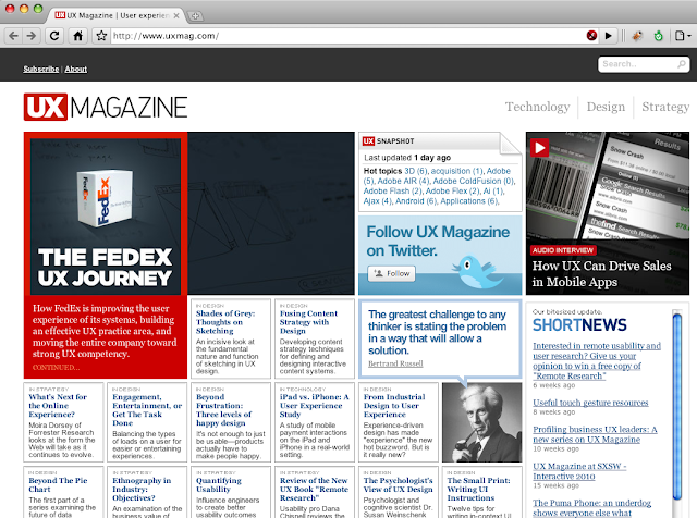
1) UX Magazine

Is it cleanly organized and orderly? Certainly it is. Is the text highly readable? Mostly yes, except for some of the categories that are the top heading in each box. Is it cluttered? I think it is. My eyes go nowhere and everywhere at the same time. It’s easy to understand the navigation and news sidebar, however, the center content seems all to have equal relative weight. Maybe that’s the intent, as the footer notes the content is based on articles published one-at-a-time. The quote from Bertrand Russell looks as if he tweeted it – I like that.
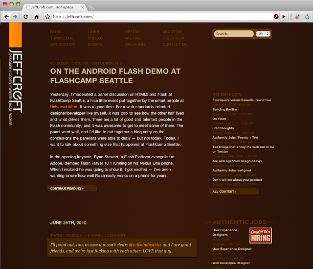
2) Jeff Croft

This looks just as organized and orderly, and in my view, much easier to understand visually. It lets the reader feel in control of the visual content and not barraged with everything at once. I don’t like everything there, but it’s the style of site I’d like to make.
Searching around for CSS frameworks I found this excellent article from Eric Meyer about the lessons of CSS frameworks. Great tips to keep in mind, especially before diving into frameworks.
This site is based on a WordPress theme, which itself is based on a 900 grid system. As I hacked at it, I mostly stripped away from it, partially because it had more functions than I wanted or needed, and partially to just simplify it (instead of just ignoring unused parts). My frustrations took root in the naming conventions and myriad div and span elements. <div class="span-13">, anyone? How about A collection of 224 Grid and CSS Layouts? No, thanks.
Anyway, this isn’t about being anti-grid. Compass looked cool, at least from its introduction. Naturally this led me to Saas. The ability to assign and use variables, perform simple math, and even simply nesting are appealing enough to give it a try. Functions and mixins? Woah. Now, I’m not sure if this will move away from such lovely-named classes, as was claimed (but not actually done) in the introductory video. But leaving that aside, I’m still tickled enough to give it a try. Their tutorial gives a quick overview.